I have been looking through a lot of drawings and the like that are scattered on my bedroom walls and underneath my bed recently, just to see how my practice has changed and to try and trace the when's, why's and how's that enabled my artistic growth.
And so I thought I'd post some examples and give brief explanations on what I think I was trying to achieve.
I did this little piece around the end of first semester, 2nd year of my course. I was starting to explore narrative in my work, and I also think I was trying to incorporate my love for the medium of comic books into it, and so I did a few experiments with tracing paper, acetate and plastic sheets.
I had the idea of presenting narrative and movement by combining unrelated scenes and leaving the viewer to create the connection, and also of presenting every frame within a sequence.
With the latter I used the film strip idea to create a flow and create a more controlled and structured presentation of my narrative based work. This work was created by painting masking fluid on a plastic sheet and soaking it in black ink.
This piece was just a simple drawing as part of an early animation for an elective class I took in 2010. But it marks the point when I started the digital side of my artistic practice.
It also is a great example of the blocked black and white that I started to employ within my work, something that I still do and am experimenting with. I had previously done black and white paper cutouts in my first year, but this work was the first where I was happy with the results and it didn't feel quite so much like craft. I don't want to put too much negative connotation on that term, it's just up until this point, when working in this style, I wasn't completely sure why I was doing it, other than it looked cool.
But this little experiment changed that for me, until that point I was using found images from film and comic books and this was the first from a reference I'd created myself. It was liberating and I've been using this style ever since, and one day I aim to fully flesh out what I'm trying to do with this particular style.
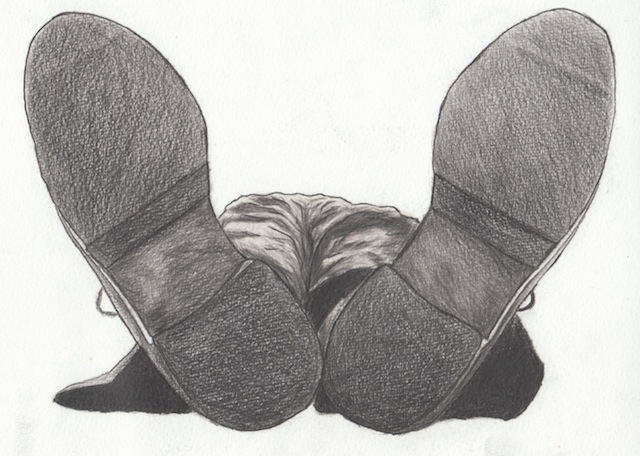
'No Moping' was the first large scale cross hatch drawing that I did and it took roughly a month, its just over A2 in size . I drew it while doing part time at RMIT.
During my second year of arts school I hit a block and struggled, which I could have worked through if I had put my mind to it. I failed a couple of subjects and got a little down on my work, technique, all those things that come with '2nd year blues'. I decided to split my 3rd and last year over two years, spending 2010 completing the subjects I failed and getting the majority of my electives out of the way so when it came to my last year I was doing nothing but drawing.
And from this decision I decided to get a studio outside of campus to work in and create. This led to being part of a group show organised in the gallery the studio back onto.
I wanted to make a splash so I used an old reference of a friend I took in 2007 while at TAFE and started drawing this piece. It sold, as well as the A4 drawing I also exhibited, to someone who wasn't part of my family or who I knew, and it really energised me and helped me get to where I am now.
This work is still under construction and is one of the exercises I do to get away from straight black and white drawings for a little while.
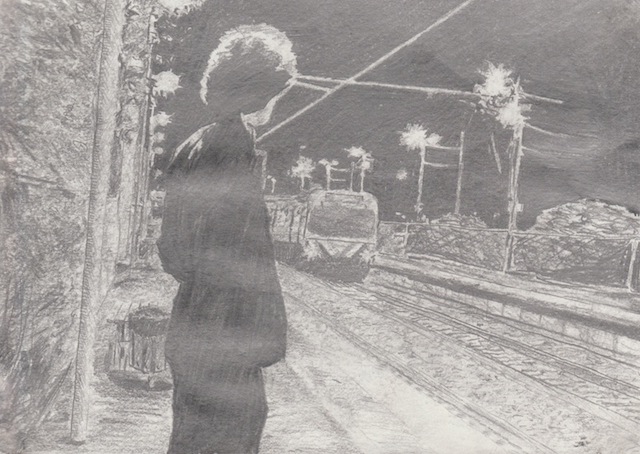
Its a scene from the Akira Kurosawa film 'Nora Inu', Stray Dog in english.
I have thought about playing with more colour and expanding my palette in the past, so far I've just gone into greys, but you never know.
This piece continues the blocked black and white style but using graphite to block in the contrast. I did this in my final year just as an exercise to give my mind a rest from the all the animation and project document writing I was doing. Its a promotional shot from the film 'Philadelphia Story', staring Cary Grant, James Stewart and Katharine Hepburn. I'd never seen the film till ACMI had their melodrama season screening, and it's awesome, if you haven't seen it, do, its amazing.
It ended up being part of a loose series of small works on black paper, a couple other can be seen in this particular post
http://joshhook.blogspot.com.au/2011/09/white-on-black.html, but more of a focus on materials than the other two, and it is a lot more effective in when looking at it. It becomes more than just a cool use of white, it becomes interactive under a light source and engages with the viewer more so than the others in the series.
Yes, so just a little insight into my artistic practice past. Its given me the idea of doing more of these but with a lot more past work. So probably in the future I'll give up more of my thoughts about what I do.